APROPO CREPES

Dolphin Mall, Sawgrass Mills

APROPO CREPES

HOLY CREPE!

Year

2022

Project Category

Interior Design / Visual Identity & Branding

Apropo Crepes is a fast-casual phenomenon, blending crave-worthy flavors with a dynamic, customizable dining experience. With over two decades of success, a passionate following, and ambitious plans for expansion, Apropo sought a brand evolution that would ignite its next chapter of growth and set a higher standard for the QSR category. The challenge was to modernize the brand while maintaining the essence that had made it a beloved destination for generations of diners.

Credits

Interior & Architectural Design: PG Studio Inc

A food court area in a shopping mall with a food stand called Apropo Crepes serving crepes. There are yellow chairs and people sitting and ordering food, with signs and menus visible.
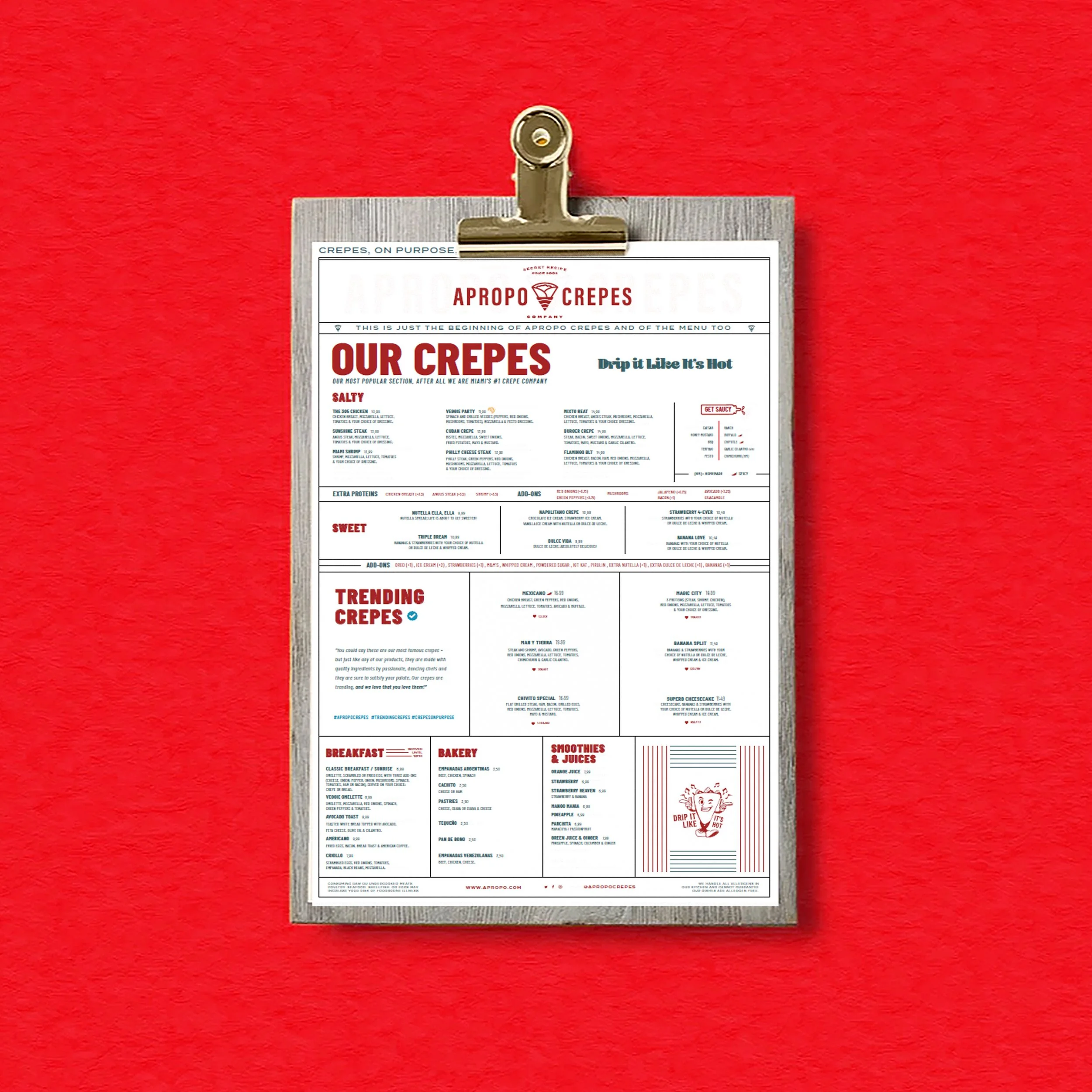
A menu from A propo Crepes restaurant displayed on a clip board against a red wall.
Ice cream milkshake topped with whipped cream and chocolate crumbs next to a folded crepe with ice cream, strawberries, caramel drizzle, and colorful candies on a light blue surface.

JASTOR VALUE

That’s where Jastor came in. We partnered with Apropo to redefine every touchpoint of the brand, creating a modern identity that is bold, scalable, and built to compete at a national and international level.

Two servings of loaded French fries in red paper cones on a light blue background, garnished with chopped green herbs and drizzled with yellow and white sauces, with some scattered herbs and pepper around.
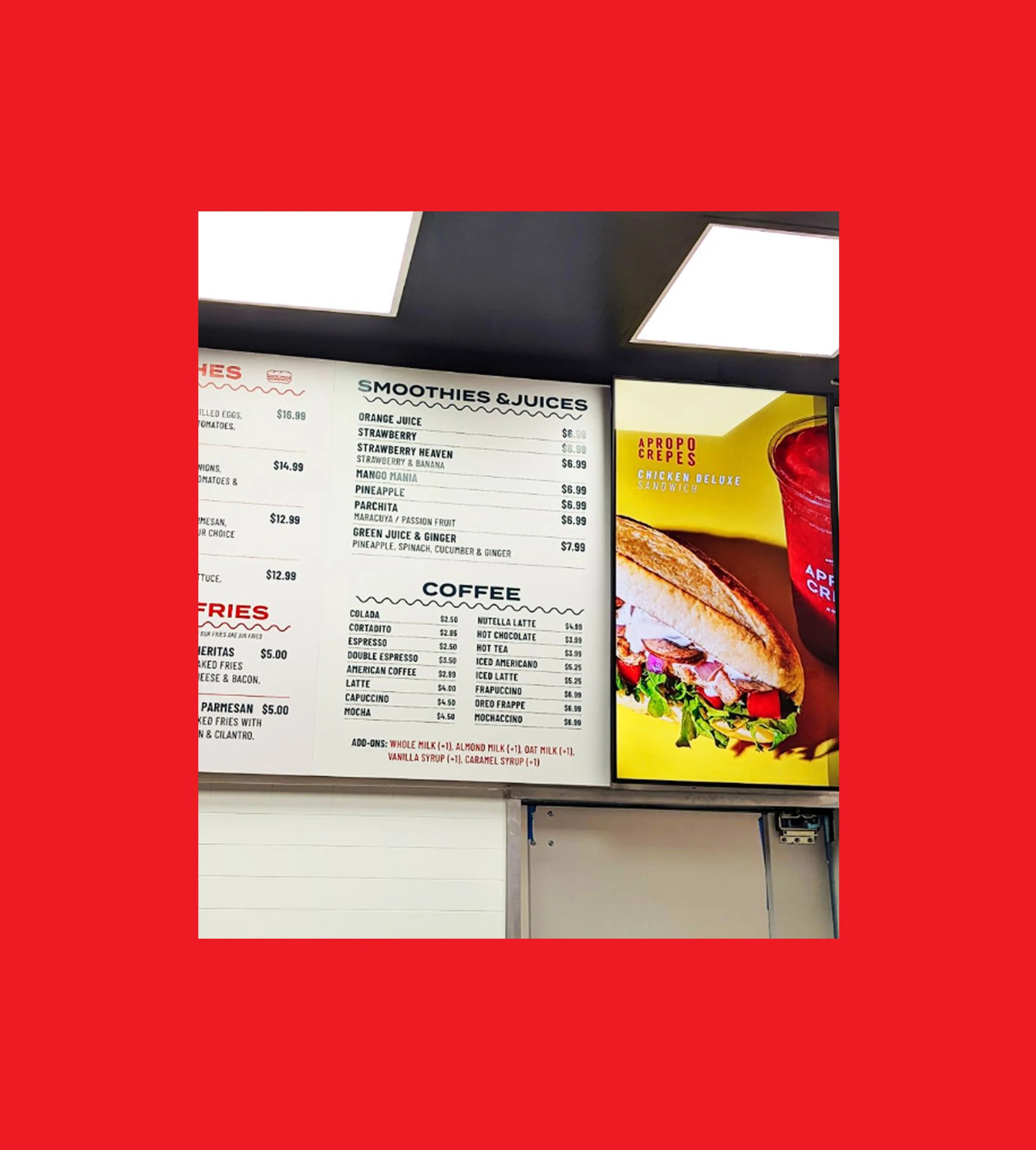
Photo of a menu board at a fast food or café counter showing beverages like smoothies and juices, coffee options, and a picture of a sandwich or wrap.

Our work included a comprehensive redesign of the visual identity, packaging systems, menus, signage, and digital presence, each element thoughtfully crafted to reflect the brand’s vibrant energy, creativity, and commitment to flavor innovation.

DESIGN SYSTEMS

APROPO CREPES

This wasn’t just a refresh—it was a strategic transformation. Jastor developed a brand platform that resonates with today’s younger, design-savvy audiences while staying true to Apropo’s loyal customer base. From color palettes and typography to packaging ergonomics and menu structure, every detail was meticulously designed with growth and operational scalability in mind, ensuring consistency across multiple locations and future markets.

IDENTITY

Multiple paper cups with red and white designs are floating in the air against a beige background. The cups feature the logo and branding of 'APPO CREPES COMPANY' in red and yellow text, mentioning a secret recipe since 2002.
A cartoon character with a round face, large eyes, and curly hair, walking and waving, drawn in red outline on a beige background.
Person holding a white tote bag with yellow text that reads 'APROPO CREPES' in front of a white textured wall. The person is wearing brown pants and has a ring on their finger.

In addition to aesthetics, we focused on the customer experience, ensuring that every interaction with the brand—from digital ordering to in-store engagement—felt seamless, inviting, and aligned with Apropo’s playful yet premium personality. The refreshed brand encourages exploration, celebrates creativity, and positions Apropo as a leader in the fast-casual landscape.

Three bottles of cold brew coffee with different labels that read 'house blend', 'blonde roast blend', and 'espresso blend' on a white surface near a window.
Smiling woman with long dark hair wearing a black apron with colorful letters and a nametag, making an OK gesture with her right hand, standing against a beige background.
Three women in yellow T-shirts with a cartoon character and text on the back, standing near a food counter. One woman is making a peace sign with her hand.
Three colorful frozen drinks in clear cups with 'APROPO CREPES' written on them, green, yellow, and red, against a pink background.

APROPO CREPES

SOLUTION

The result is a cohesive, high-impact brand that captures attention, inspires loyalty, and drives growth. Apropo is now equipped with a design system that not only strengthens its current presence but also positions it to scale confidently, delight new audiences, and thrive in a competitive national and international market.

Neon sign for a company called Applebee's with the tagline "Secret Recipe Since 2002" on a wooden paneled wall.
Person holding a three-tiered clear plastic food container with salads and a cake, in front of a person wearing a white apron with the words 'Auntie Ann's' printed on it.
A hand holding a clear plastic cup with a logo reading 'The Crepe Club Miami, FL' containing a lemon-based beverage with lemon slices, ice, and a pink straw, against a plain white background.
Two people, a man and a woman, standing side by side, wearing white t-shirts with red text and graphics on the back. The man's shirt has a cheerful flower character and the words "The Crepe Club" and "Since 2002." The woman's shirt has a red circle emblem with the words "Apropo Crepes" and "Miami, FL." The woman has her hand on the man's shoulder, and they are facing away from the camera against a plain light grey background.
A person holding a menu for Apropo Crepes in a restaurant or food court with a blurred background showing the restaurant's sign and other people.
Inside a shopping mall restaurant area with yellow chairs, a red illuminated panel, and signage for various stores, including Aropo Crepes, Sunglass Hut, and others. People are seated and walking in the background.
A creamy crepe in a clear plastic cup with a blue straw, with a purple background.
Illuminated round sign says 'Aropo Crepes Co' with 'Est. 2002' above, located indoors with ceiling and lighting visible in the background.
A dessert with whipped cream and chocolate cookie crumbles in a clear glass dish.

Other Projects

K Pizza

Pollos & Jarras

The Daily Creative Food